Business
Explore IT Cyber
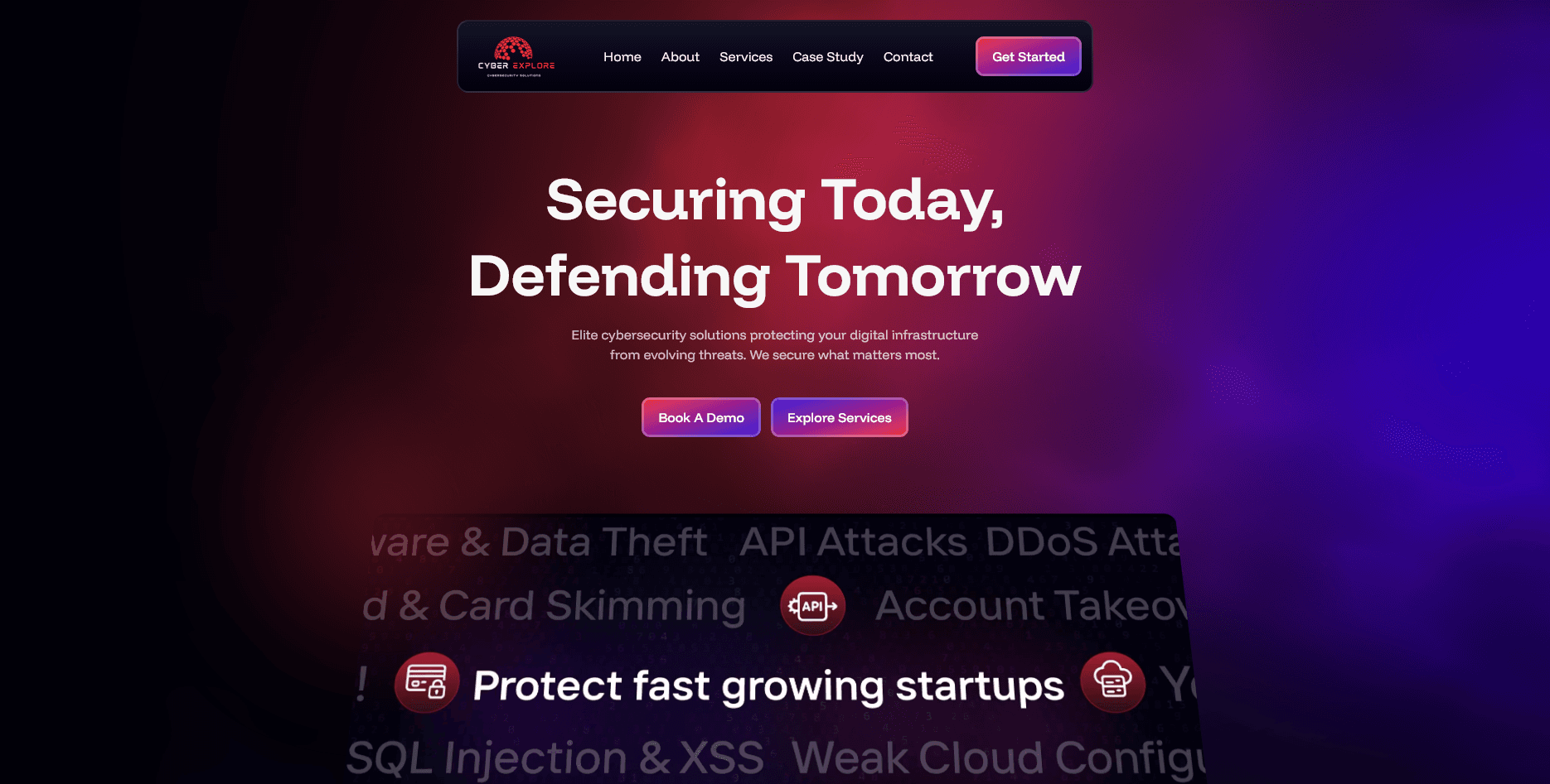
Case Study
A Cyber Security Startup needed to redesign and rebuild their template website into a dark modern website with lead generation form.
Project Context
Business context and product objective.
Explore Cyber is a cybersecurity partner serving operations, compliance, and IT leaders. The website needed to turn complex service offers into a clear narrative, reduce buyer hesitation, and support sales conversations before the first call.
Business
Explore IT Cyber
Product Type
Cyber Security
Needed Outcome
Clearer user flow, stronger trust, and higher-intent actions.
Business Problem
The core issues affecting conversion and usability.
Website was made with hostinger's ai website builder. Generic stock images with bad UI
Website had no clear call to action, and value proposition was not good.
Website color theme and style was not following their brand guidelines.
Website didn't have a working form for collecting leads or getting customers info.
Success Criteria
What needed to be true at launch.
Clarify the service architecture for non-technical and technical buyers.
Create a trust-first page with strong conversion focused design.
Increase consultation intent through clearer CTA.
Intregrate google sheets with the form for collecting leads from the website.
Execution
Scope owned across implementation and delivery.
Research about the business and customers for better results in design & development.
Design a responsive modern good looking conversion focused website.
Defined a modular UI section system for repeatable page builds.
Optimized loading strategy, image handling, and interaction cost.
Worked with client stakeholders to refine messaging and landing flow.
Approach
How the solution was structured and shipped.
Step 01
Started with content hierarchy before visual styling. The page order was mapped around buyer questions: what this solves, why this team, what to do next.
Step 02
Trust-building decisions came early: proof blocks were moved above deeper service detail so visitors could validate credibility before committing time.
Step 03
The layout system was built as reusable section patterns with predictable spacing and typography behavior, so additional pages could ship without redesigning foundations.
Step 04
Performance constraints were treated as design constraints, keeping media controlled and interactions restrained to preserve clarity.
Frontend/Product Decisions
Meaningful choices that shaped clarity and trust.
Primary consultation actions stay visually dominant, while secondary exploration links remain available but quieter.
Client trust markers were placed before long technical copy to reduce skepticism and shorten the validation loop.
Heading scales and paragraph width were tuned for executives scanning quickly on desktop and mobile.
A fixed structural rhythm created predictable reading flow across service, process, and contact sections.
Buttons, cards, and evidence blocks were re-ordered on smaller screens to keep decision points visible without fatigue.
Screens
Selected desktop and mobile views from the final build.
Tradeoffs
What was difficult and how decisions were made under constraints.
Service content had to stay accurate for technical stakeholders while remaining clear for leadership and procurement.
Existing copy and assets came from different revisions; the frontend system needed to absorb inconsistency without feeling fragmented.
The interface needed premium presence without decorative patterns that weaken trust in enterprise contexts.
Result
Practical improvements after launch.
Service positioning became easier to understand in one pass.
Lead path clarity improved through stronger CTA sequencing.
Mobile reading quality improved through tighter hierarchy and spacing decisions.
The reusable section system reduced effort for future landing page launches.
Client Signal
Feedback from the project stakeholder.
The new site finally explains our value clearly. Sales calls now start with better context and stronger trust.
Supporting Tech
Tools used to deliver and maintain the solution.
Next
Related case studies in similar product contexts.
SaaS Product Frontend
A SaaS launch experience focused on product clarity, activation intent, and a scalable frontend foundation for growth experiments.
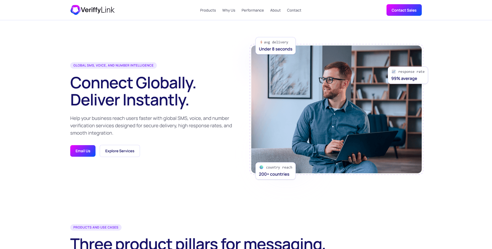
Messaging / Business Platform
A messaging and verification platform interface redesigned to make workflow actions clearer and reduce hesitation in high-volume operations.