Business
VeriffyLink
Case Study
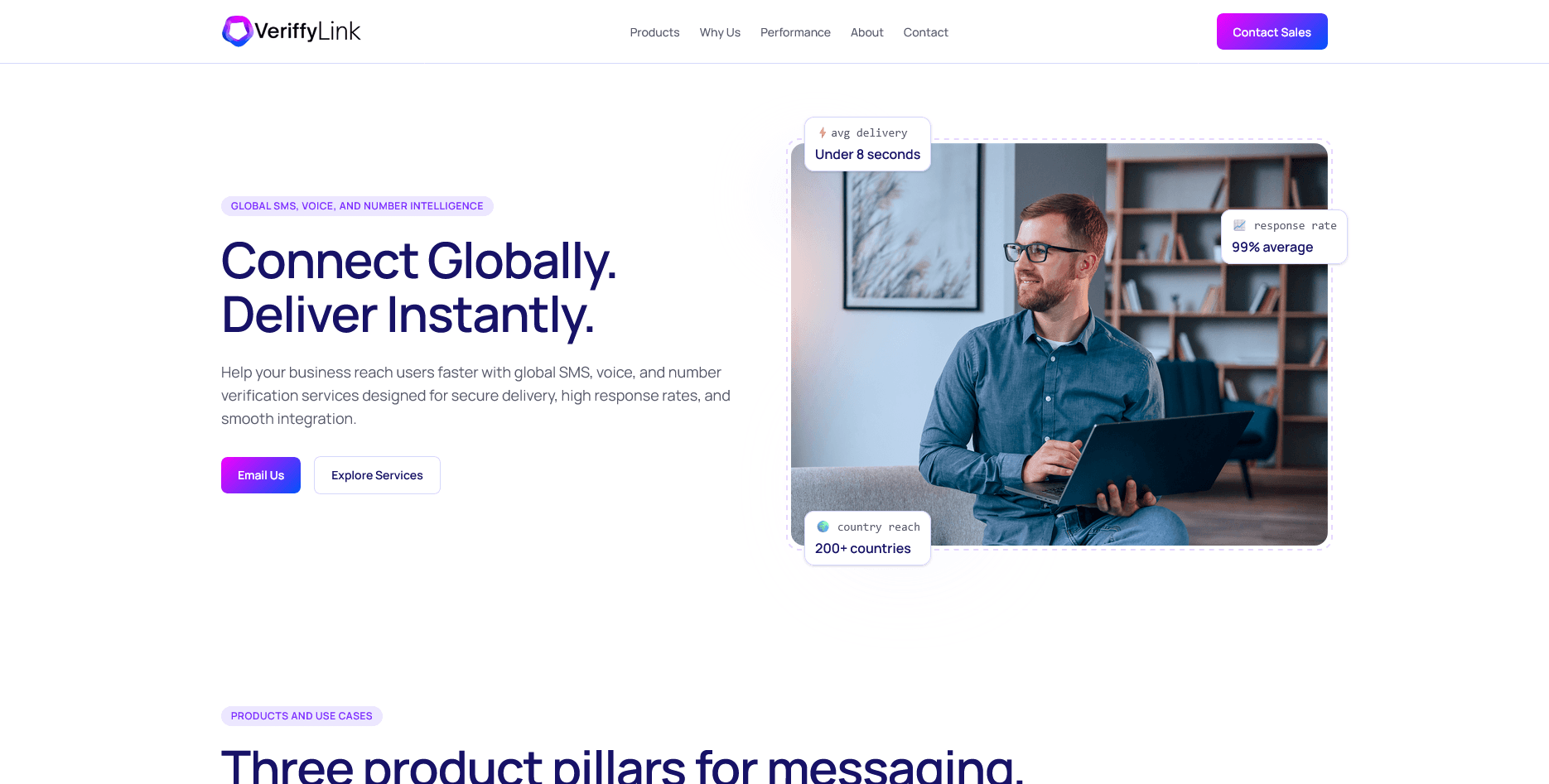
A messaging and verification platform interface redesigned to make workflow actions clearer and reduce hesitation in high-volume operations.
Project Context
Business context and product objective.
VeriffyLink provides business messaging and verification workflows used by operations teams. The product-facing pages needed clearer action cues, stronger trust language, and a more reliable responsive structure across user contexts.
Business
VeriffyLink
Product Type
Messaging / Business Platform
Needed Outcome
Clearer user flow, stronger trust, and higher-intent actions.
Business Problem
The core issues affecting conversion and usability.
Users struggled to identify the primary workflow in dense interface sections.
Messaging around compliance and delivery reliability was under-explained.
Navigation priorities changed across breakpoints, causing orientation issues.
Inconsistent UI patterns made future expansion slower.
Success Criteria
What needed to be true at launch.
Make core workflows understandable at a glance.
Improve trust communication for reliability and security claims.
Stabilize responsive behavior for tablet and mobile usage.
Create a scalable UI baseline for future product pages.
Execution
Scope owned across implementation and delivery.
Implemented page-level frontend architecture for product and marketing surfaces.
Standardized responsive layout logic and component spacing behavior.
Restructured interface flow to prioritize high-frequency user actions.
Improved accessibility semantics and keyboard-friendly CTA behavior.
Collaborated on copy hierarchy to align product logic and visual sequencing.
Approach
How the solution was structured and shipped.
Step 01
Mapped the user journey by workflow frequency, then rebuilt section order around primary actions and trust checkpoints.
Step 02
Reduced visual noise by consolidating repeated patterns into a smaller UI language with consistent rhythm.
Step 03
Used reusable card and section primitives to speed implementation while keeping page quality stable.
Step 04
Addressed performance as part of build quality by minimizing heavy effects and prioritizing content visibility.
Frontend/Product Decisions
Meaningful choices that shaped clarity and trust.
Primary messaging actions were surfaced earlier to shorten time-to-understand.
Operational trust statements were paired with concise supporting context.
The same mental model was preserved across desktop, tablet, and mobile layouts.
Spacing patterns and card styles were standardized for faster future development.
Complex sections were broken into smaller visual groups to reduce cognitive load.
Screens
Selected desktop and mobile views from the final build.
Tradeoffs
What was difficult and how decisions were made under constraints.
The platform needed to present a lot of context without overwhelming decision-makers.
Operations, product, and leadership stakeholders needed different levels of detail from the same flow.
Delivery timelines were tight, but the frontend still needed long-term structure.
Result
Practical improvements after launch.
Core messaging workflows became easier to identify and act on.
Trust communication improved through cleaner compliance and reliability framing.
Responsive consistency improved across breakpoints and content states.
The UI foundation now supports faster iteration with less regression risk.
Client Signal
Feedback from the project stakeholder.
The interface now feels intentional and reliable. Teams understand where to act faster, especially on mobile.
Supporting Tech
Tools used to deliver and maintain the solution.
Next
Related case studies in similar product contexts.
SaaS Product Frontend
A SaaS launch experience focused on product clarity, activation intent, and a scalable frontend foundation for growth experiments.