Business
Inspo Team
Case Study
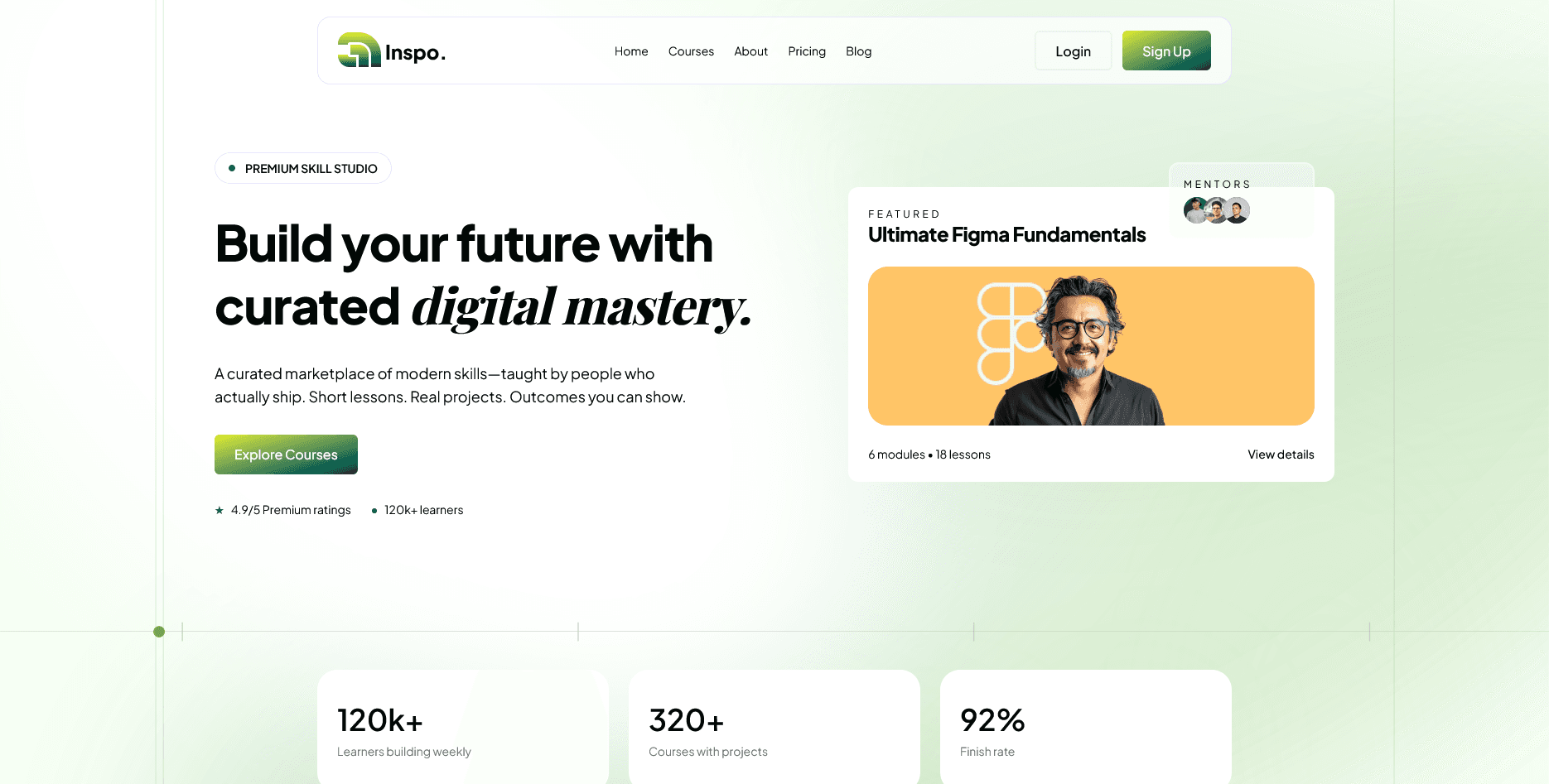
A SaaS launch experience focused on product clarity, activation intent, and a scalable frontend foundation for growth experiments.
Project Context
Business context and product objective.
Inspo is a digital product focused on structured learning and faster user activation. The launch page needed to communicate product value in seconds, align feature messaging with signup intent, and remain flexible for ongoing iteration.
Business
Inspo Team
Product Type
SaaS Product Frontend
Needed Outcome
Clearer user flow, stronger trust, and higher-intent actions.
Business Problem
The core issues affecting conversion and usability.
Feature messaging was fragmented and did not map to user outcomes.
The page had visual inconsistency between marketing blocks and product screenshots.
First-time visitors lacked confidence about who the product was built for.
Initial layouts were difficult to evolve for experiment cycles.
Success Criteria
What needed to be true at launch.
Create a single clear product narrative from headline to conversion.
Support quick edits for future positioning and experiment changes.
Improve readability and focus across mobile and laptop breakpoints.
Keep the UI premium while preserving high performance.
Execution
Scope owned across implementation and delivery.
Built the full frontend page architecture and responsive system.
Implemented reusable section components for rapid iteration.
Refined typography and contrast for product-first readability.
Handled asset optimization and layout-level performance cleanup.
Aligned implementation with product messaging priorities.
Approach
How the solution was structured and shipped.
Step 01
The structure was planned around activation logic: problem tension, product mechanism, proof, then conversion.
Step 02
Each section was built as a reusable block with controlled variants so future changes could happen without rewriting layout logic.
Step 03
Typography and spacing were treated as product communication tools, not decoration, with intentional breathing room between concepts.
Step 04
Animations stayed minimal and purposeful to support hierarchy without distracting from the narrative.
Frontend/Product Decisions
Meaningful choices that shaped clarity and trust.
Headlines were rewritten around user outcomes, reducing abstract marketing language.
Product visuals were framed consistently so interface details looked intentional and trustworthy.
Whitespace was increased between sections to improve comprehension before CTA moments.
Section order was tuned for mobile so key proof appears before heavy detail blocks.
Screens
Selected desktop and mobile views from the final build.
Tradeoffs
What was difficult and how decisions were made under constraints.
The page had to feel premium while still shipping inside a startup launch timeline.
Frequent messaging changes risked visual drift; component constraints prevented fragmentation.
Interactions were trimmed until they improved orientation instead of adding visual weight.
Result
Practical improvements after launch.
Product value became easier to understand from the first viewport.
Signup flow felt more direct through clearer CTA placement.
Frontend structure became easier to maintain for ongoing growth experiments.
The launch page delivered a stronger premium impression with restrained visuals.
Client Signal
Feedback from the project stakeholder.
We can now test copy and sections quickly without breaking layout quality. It feels like a real product brand now.
Supporting Tech
Tools used to deliver and maintain the solution.
Next
Related case studies in similar product contexts.
Messaging / Business Platform
A messaging and verification platform interface redesigned to make workflow actions clearer and reduce hesitation in high-volume operations.